
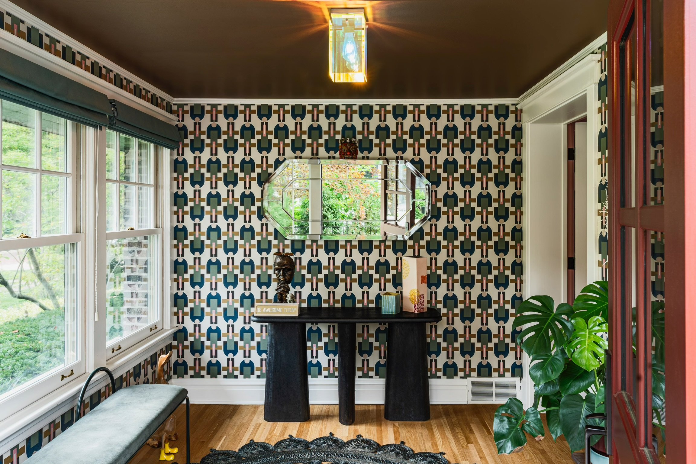
How Do You Mix Colors and Patterns Without Making a Space Feel Busy?
If you’ve ever pulled a paint chip, a wallpaper sample, and a fabric swatch onto the same table and felt a wave of doubt, you already understand a common question asked by homeowners; how can you mix colors and patterns without making a space feel busy?
Many homeowners assume the safest path is to hold back from all those choices. They might pick one accent wall, one neutral sofa, one small-print pillow, and call it done. But restraint may not prevent a room from feeling busy, and an overly cautious palette often just reads as flat instead of calm.
The difference between a space that feels layered and intentional and one that feels overwhelming usually doesn’t come down to how much color or pattern is present. It comes down to proportion, scale, and contrast; three principles that can be learned and applied on purpose. This guide helps homeowners understand how to mix these elements boldly while still creating a room that feels cohesive.
Quick Answer
How you mix colors and patterns without a space feeling busy:
Anchor the palette using the 60-30-10 proportion: a dominant color, a secondary color, and an accent
Vary pattern scale using the rule of three: one large-scale "hero" pattern, one medium, one small
Repeat at least one shared color or undertone across every pattern in the room
Match value contrast (how light or dark elements are) as carefully as you match hue
Build in visual rest with solids, negative space, and a neutral backdrop
Treat everything visible from one vantage point, including adjoining rooms, as a single composition
A room can hold a lot of color and pattern and still feel restful. What matters is whether that richness is organized.
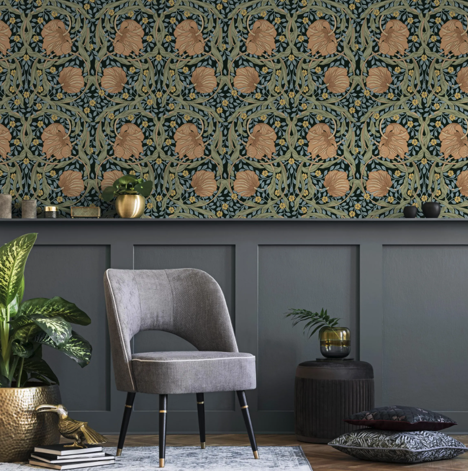
What Actually Makes a Room Feel "Busy"?
"Busy" is a feeling, not a quantity. A powder room wrapped in a bold botanical wallpaper with jewel-toned fixtures can feel serene, while a living room with only three muted colors can feel unsettled if none of them relate to each other. The difference lies in whether the eye has a clear hierarchy to follow, something to land on first, somewhere to rest, and a logic connecting everything else.
This is not just a design opinion. Research comparing preference ratings across eighty real interior scenes found that visual complexity was strongly and positively linked to how much people liked a space, not how little. In other words, more color and pattern is not inherently the problem, according to a study published in the Journal of Interior Design. What separates a room that reads as rich from one that reads as chaotic is organization, not volume.
Vision scientists studying how people scan a scene have found something similar from the opposite direction. Measurable clutter (things like edge density and how much color varies from one small area to the next) correlates closely with how complex and disorganized a space feels to a viewer, independent of how many objects are technically present, according to clutter research published in the Journal of Vision. A room can contain a great deal of visual information and still register as calm, as long as that information is grouped and weighted in a way the eye can follow.
That reframes the whole question. Instead of asking "how do I use fewer colors and patterns," the more useful question is "how do I give what I am using a clear order."
The Color Side: Building a Palette That Holds Together
Start With a Proportion, Not Just a Palette
Choosing three or four colors that you love is only half the work. The other half is deciding how much of each one to use, and this is where most color schemes start to feel busy: every color gets roughly equal weight, so nothing reads as dominant and the eye has no anchor.
The 60-30-10 proportion is a useful starting framework: roughly 60 percent of a room in a dominant color (typically walls, floors, and other large surfaces), 30 percent in a secondary color (large furniture, drapery, cabinetry), and 10 percent in an accent color used more sparingly, in art, pillows, or a light fixture.
Some designers trace the underlying logic back to the golden section, the same proportional relationship that shows up in natural forms like a nautilus shell, which is part of why an uneven split tends to read as more settled than a perfectly even one, per Apartment Therapy. Treat the ratio as a starting point rather than a formula to follow exactly. What matters most is that one color clearly leads and the others support it, rather than all of them competing for the same amount of attention. This proportion-first thinking is central to how we approach color at Loczi Design, where every palette starts with a dominant story rather than a list of favorite hues.
Match Value Contrast, Not Just Hue
Two colors can be technically "matching" on a color wheel and still clash if their values, meaning how light or dark they are, are too similar or too mismatched relative to everything else in the room. A soft blush next to a soft sage will often feel murky and indecisive, even though the hues themselves are compatible, because there is not enough contrast for the eye to separate one from the other.
Before finalizing a palette, it helps to squint at your swatches or convert a photo of them to grayscale. If everything blurs into the same gray tone, the room will likely feel flat rather than calm. If the values swing wildly from one item to the next with nothing in between, it will likely feel jumpy. A useful goal is a range: something quite light, something quite dark, and a few steps in between, so the eye has a path to travel rather than a single note repeated everywhere.
Keep Undertones on the Same Team
Undertone, the subtle warm or cool cast beneath a color's surface hue, is one of the most common reasons a "coordinated" palette still feels slightly off. A warm greige next to a cool gray can look like a mistake even though both are technically neutral.
Before committing to a palette, hold your neutrals and your accent colors next to each other in the room's actual lighting. If one keeps pulling pink, yellow, or blue in a way that fights the others, it is worth swapping before the order goes in, not after. Undertone is a technical check, but color also carries an emotional read that is worth weighing alongside it, a topic we dig into further in our take on choosing color with intention.
The Pattern Side: Why Scale Decides Whether It Reads as Rich or Chaotic
Pattern is one of the design elements we care about most at Loczi Design, and scale is almost always the difference between a pattern mix that feels curated and one that feels accidental.
The Rule of Three: Large, Medium, Small
The single most common reason two patterns clash is not clashing colors. It is clashing scale. Two prints of a similar size compete for the same amount of visual attention and the eye cannot settle on either one. Vary the scale, and the same two patterns that fought each other suddenly work together.
A reliable starting formula is the rule of three: one large-scale "hero" pattern that sets the tone (a rug, drapery, or a statement wallpaper), one medium-scale pattern that contrasts with it (upholstery or bedding), and one small-scale pattern used more sparingly for texture (a trim, a lampshade, a stack of pillows).
As a rough guide, small-scale prints typically repeat every one to four inches, while large-scale prints can repeat every twelve inches or more, giving the eye a genuinely different rhythm to read at each scale rather than three versions of the same size, per Lark Interiors. Three is a starting point, not a hard ceiling. What matters is that each pattern in the room is doing a distinct job rather than duplicating one already being done elsewhere.
Give One Pattern the Hero Role
Every busy-feeling room with multiple patterns has one thing in common: no single pattern was allowed to lead. When two or three prints all compete to be the star, the eye never settles. Pick one, usually the largest scale or the one on the largest surface, and let every other pattern and color in the room support it rather than rival it. That hero pattern can also be the easiest way to source your palette. Pull two or three colors directly from it and repeat those same colors in your medium and small-scale choices. This kind of restraint is exactly what is driving the current resurgence of pattern-forward interiors, a shift we unpack in our look at where pattern is headed.
Let Texture Do Some of the Work
Texture (grasscloth, boucle, rattan, a woven rug, unlacquered brass) behaves like a quiet pattern. It adds depth and visual interest without adding another competing print, which makes it one of the easiest tools for keeping a richly patterned room from tipping into being busy. If a space already has its large and medium pattern moments covered, reach for texture rather than a third print to round it out. It reads as intentional layering rather than one more thing for the eye to process. This texture-first restraint is a hallmark of the quiet luxury approach, which we explored in more depth here.
The Thread That Ties Color and Pattern Together
Scale and proportion each do their own job, but the element that actually unifies a mixed room is a repeated color running through everything in it. When a large floral rug, a striped chair, and a small geometric pillow all share even one color in common, they read as a single, considered composition instead of three unrelated choices placed in the same room. That shared thread is what allows a hero pattern, a supporting pattern, and a textured accent to feel like they were chosen together rather than assembled at random.
This is also the fastest way to troubleshoot a room that already feels busy. Before removing anything, check whether every pattern and every accent color in the space shares at least one common color. Often the fix is not to take something away, but to swap one piece for a version that pulls from the same palette everything else is already using.
Common Mistakes That Push a Room Into "Busy" Territory
Same-scale pattern clash. Two prints of a similar size, even in coordinating colors, will compete rather than complement.
No shared color anchor. Patterns chosen individually, rather than pulled from a common palette, rarely read as cohesive together.
No visual rest. A room with pattern on every surface and no solid color, plain texture, or open wall space gives the eye nowhere to pause.
Too many hero moments. More than one large-scale, high-contrast pattern competing for the lead role, with nothing clearly supporting.
Mismatched value contrast. Colors that are technically coordinated but too similar in lightness or darkness to separate visually.
Ignoring the full sightline. A room that works in isolation but clashes with what is visible from the hallway, kitchen, or adjoining space.
Why Sightlines Matter More Than Any Single Room
A room rarely exists in isolation, especially in an open floor plan. If a living room is visible from the kitchen, or a primary bedroom opens directly onto a sitting area, the eye is processing both spaces as one composition whether or not they were designed that way. A palette that feels perfectly balanced in the room where it was chosen can suddenly feel busy the moment it is seen alongside a completely different palette next door.
Before finalizing colors and patterns for any one room, stand at the vantage point where it will most often be seen, from the front door, from the kitchen island, from the top of the stairs, and evaluate everything visible from there together. This is often where an otherwise well-planned room quietly goes wrong: not because anything in it is busy on its own, but because it was never considered alongside what sits just beyond the doorway.
How Lighting Changes the Way Color and Pattern Read
Color and pattern are not fixed. They shift with light. A palette with carefully matched values under bright daytime light can lose that careful contrast entirely under warm evening lamplight, when everything shifts toward amber and shadows deepen. A cool gray that looked crisp on a north-facing wall can read as flat and lifeless once the sun moves.
Before committing to a final palette, view your key swatches at more than one time of day, and under whatever bulb temperature you plan to actually use. A pattern that feels perfectly scaled under a bright showroom light can read as noisier or busier under the dimmer, warmer light most living spaces use in the evening.
How Loczi Design Approaches Color and Pattern
At Loczi Design, color and pattern are never treated as separate decisions layered on top of a finished floor plan. Our expert design team is part of the design concept from the beginning, developed together so that proportion, scale, and undertone are considered as one system rather than reconciled after the fact.
Our palettes often draw from the Bay Area's own landscape, the blues of the coastline, the greens of the surrounding hills, warm terracotta tones, so that a home feels connected to where it sits rather than dropped in from somewhere else. We are just as comfortable balancing an unexpected, saturated color combination as we are working in a quieter, tonal palette of layered grays and blues. In either case, the goal is the same: a space that feels considered and cohesive, not just decorated.
Pattern gets the same intentionality. A bold motif on a statement wall or a custom rug is rarely left to stand alone. It typically echoes, in a smaller and quieter way, through upholstery, drapery, or art elsewhere in the room, so the pattern reads as a thread running through the space rather than a single, isolated moment competing with everything around it.
You can see this approach carried through real projects in our portfolio, and read more about how it fits into the broader design process in our approach to a project from concept to completion.
A Practical Process for Mixing Color and Pattern Without the Guesswork
Step 1: Choose Your Hero Select the one large-scale pattern or bold color moment that will anchor the room, and commit to it before choosing anything else.
Step 2: Pull Your Palette From It Identify two or three colors directly from the hero pattern to use as your dominant, secondary, and accent colors throughout the space.
Step 3: Layer in Scale Add a medium-scale pattern that shares at least one color with the hero, followed by a small-scale pattern or texture for the final layer.
Step 4: Check Value Contrast Step back, or squint, and confirm there is a genuine range from light to dark rather than everything sitting at a similar tone.
Step 5: Build in Rest Identify where the solids, negative space, or plain texture will live so the eye has somewhere to pause between patterned elements.
Step 6: Test the Full Sightline Evaluate the room alongside whatever is visible from its main vantage point, and at more than one time of day, before finalizing selections.
This process will not remove every judgment call. Design still involves an eye for what feels right in a specific space. But it replaces guesswork with a sequence that consistently produces rooms that feel layered and intentional rather than accidental.
Ready to bring a bolder, better-balanced palette into your own home? Explore our interior design services or get in touch with Loczi Design to start the conversation.
General Inquiries: designer@loczidesign.com 2358 Pine Street, San Francisco, CA 94115 (415) 431-6367
Frequently Asked Questions
-
There is no fixed number. A room with five well-organized colors and patterns can feel calmer than one with two poorly matched ones. What matters is proportion (one dominant, one secondary, an accent) and pattern scale (large, medium, small), not a hard count.
-
Yes. Mixing pattern types, such as a floral with a geometric or a stripe, often works better than mixing two similar patterns, as long as the scale differs and at least one color is shared between them.
-
Check for a shared color running through every pattern in the space first. Often the fix is swapping one piece for a version pulled from the same palette, rather than removing pattern altogether.
-
Not necessarily. A well-scaled large pattern can actually make a small room feel more intentional, while several small, disconnected patterns can make it feel cluttered. Scale and a shared palette matter more than square footage.
-
Ideally together. Choosing a hero pattern or anchor color first, then building furniture, finishes, and smaller patterns around it, tends to produce a more cohesive result than layering pattern onto an already finished plan.